Here are 5 latest web design trends that will also help to make 2021 a bit brighter.
-
Parallax animation
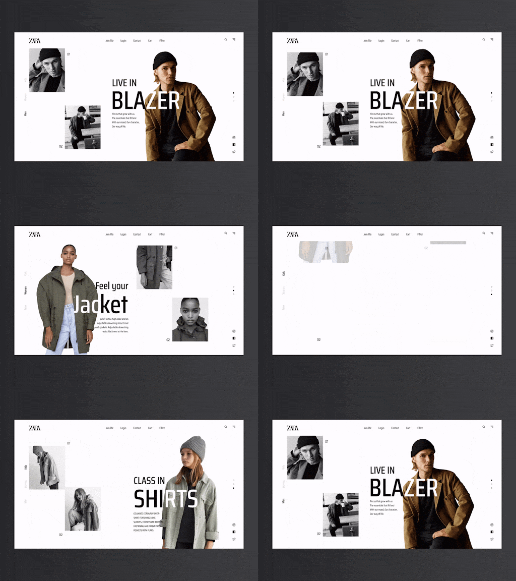
Parallax effects have been a trend in website design for years, and in 2021 we hope to see more creative explorations of what can be accomplished with parallax.
Remember that too much movement in parallax effects can be harmful to people with vestibular disorders because the illusion of depth and movement can cause disorientation and dizziness. Here are some guidelines we see more designers taking into account to ensure they incorporate parallax minimally and without causing harm:- Don’t let parallax effects distract from the important information.
- Don’t make it harder for the user to complete an important task.
- Keep the number of parallax effects to a minimum.
- Minimize the amount of parallax movement within each instance.
- Include an option for users to turn off parallax effects.
-
Videos as Design Components
Videos are always omnipresent in website design. In case you need to add interviews or promotional videos to your website, videos are the best way to involve your audience by enthusiastically delivering crucial data. Now videos are playing a new role in website design. From being totally informational, they are converting to design elements. Due to the seamless creation of new technologies, now videos can be included in the website design in exciting and new manners.
-
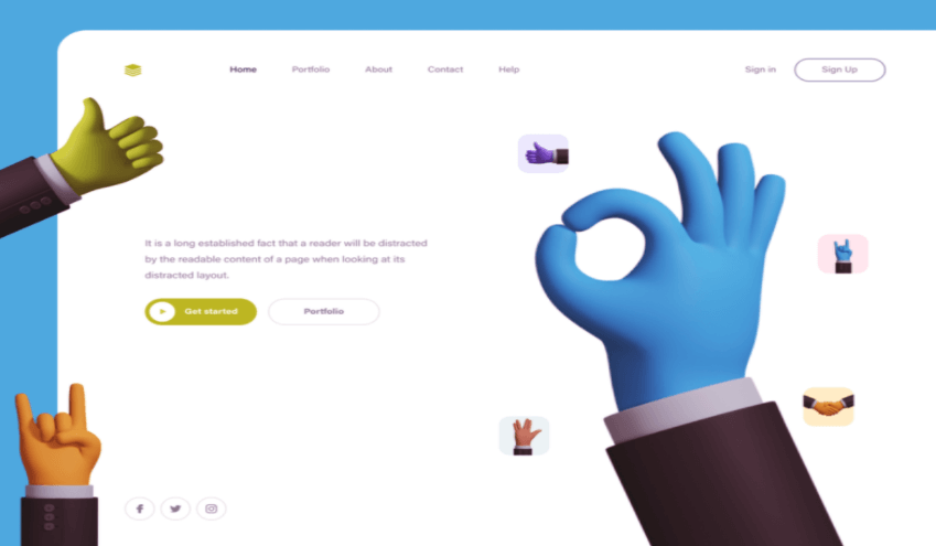
3D Illustrations
The lines between virtual reality and reality are confusing. 3D effects and strategies in the 2D space are good instances of this in action. Designers are exploring every 3D element, from animations and illustrations to scenes made with images and objects. Illustrations can add 3D effects and intensity with shadows and simply the right concept in the creative procedure. And this might cause something that has a more realistic feel.

-
Dark Mode
The dark mode is one of the most popular trends for 2021. It is trendy as it offers a low-contrast application or website that you can easily browse through in low-light environments. It helps you highlight a particular content type as well.
Some other reasons to go for this trend include:- The dark mode works as a battery saver.
- It gives your device a cool and modern appearance.
- Your eyes don’t get stressed while using a device in a low-light environment.
-
Light Colors
In upcoming trends, do you want your user to keep looking at your web pages? Then, opt for light colors. These kinds of comfortable colors are sometimes grayed-out or dulled, just like a cloudy day.
Many designers utilize muted colors for displaying minimalist looks. Moreover, these colors also offer a more elegant and natural feel.

People having good knowledge of Financial accounting can get an Accounting Certification from StudySection to increase their chances of getting a job in this field. You can get a foundation level certification if you are new to Financial accounting or you can go for advanced level certification if you have expert level skills in Financial accounting.


