
Bootstrap Labels
Bootstrap Labels are used to provide some additional or valuable information about something like counts, tips, important notes, warning messages etc. For this, we can use inline labels using class .label. To use bootstrap, include bootstrap css and js files and also include jQuery file in your application.
<!DOCTYPE html>
<html lang="en">
<head>
  			<title>Bootstrap Label Example</title>
  			<meta charset="utf-8">
  			<meta name="viewport" content="width=device-width, initial-scale=1">
  			<link rel="stylesheet" href="http://maxcdn.bootstrapcdn.com/bootstrap/3.3.7/css/bootstrap.min.css">
</head>
<body>
<div class="container">
  			<h1>Example Label heading <span class="label label-default">1</span></h1>
  			<h2>Example Label heading <span class="label label-default">2</span></h2>
  			<h3>Example Label heading <span class="label label-default">3</span></h3>
  			<h4>Example Label heading <span class="label label-default">4</span></h4>
  			<h5>Example Label heading <span class="label label-default">5</span></h5>
  			<h6>Example Label heading <span class="label label-default">6</span></h6>
</div>

<script src="https://ajax.googleapis.com/ajax/libs/jquery/1.12.0/jquery.min.js"></script>
<script src="http://maxcdn.bootstrapcdn.com/bootstrap/3.3.7/js/bootstrap.min.js"></script>

</body>
</html>
The output of above html sample is shown in the following screenshot:
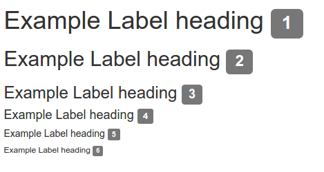
Screenshot 1
We can use additional contextual labels classes like .label-primary, .label-success etc. along with .label class to highlight information in different colors.
<p>This is default <span class="label label-default"> Gray</span> color label</p>
<p>This is primary <span class="label label-primary"> Blue</span> color label</p>
<p>This is success <span class="label label-success"> Green</span> color label</p>
<p>This is information <span class="label label-info"> Light blue</span> color label</p>
<p>This is default <span class="label label-warning"> Orange</span> color label</p>
<p>This is red <span class="label label-danger"> Red</span> color label</p>
The output of above html sample is shown in following screenshot 2.
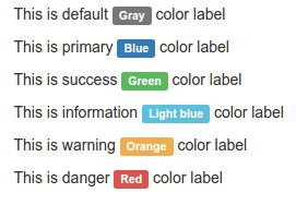
Screenshot 2
Bootstrap Badges
A badge can be used to denote any numerical value. Badges can be used to provide any important information such as unread messages, number of items added to cart, unread notifications, updates etc. To use badges in your application, simply add “badge” class to the opening span tag.
<h2>Badges</h2>
  	<a href="#">News <span class="badge">5</span></a><br>
  	<a href="#">Comments <span class="badge">10</span></a><br>
  	<a href="#">Updates <span class="badge">2</span></a> <br>
	<a href="#">Shopping Cart <span class="badge">8</span></a> <br>
	<a href="#">Unread <span class="badge">5</span></a> <br>
The output of above HTML sample is shown in following screenshot 3.
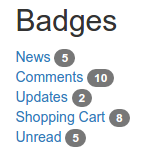
Screenshot 3
Bootstrap badges can also be used inside other elements such as buttons. Let’s see how we can add badges to buttons.
<h2> Badges on Buttons </h2>
<button type="button" class="btn btn-primary">Notifications <span class="badge">7</span></button>
<button type="button" class="btn btn-success">Notifications <span class="badge">3</span></button>
<button type="button" class="btn btn-danger">Critical Updates <span class="badge">5</span></button>
The output of above HTML sample is provided in following Screenshot 4.
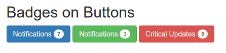
Screenshot 4
Badges can be applied to any dom element such as paragraph (<p>), heading (<h1>, <h2> etc.).
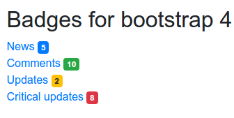
In the sample, bootstrap having version 3.3.7 is used. Bootstrap 4 provides more contextual classes, means more features for providing different colors and shapes to badges. Bootstrap 3.3.7 provide only gray color and rectangular shapes to badges when we use any dom element except buttons.
Contextual classes badge-primary, badge-success, badge-danger, badge-warning etc can be used along with badge class inside <span> to display colorful badges with bootstrap 4.
<h2>Badges for bootstrap 4</h2>
<a href="#">News <span class="badge badge-primary">5</span></a><br>
  	<a href="#">Comments <span class="badge badge-success">10</span></a><br>
  	<a href="#">Updates <span class="badge badge-warning">2</span></a> <br>
	<a href="#">Critical updates <span class="badge badge-danger">8</span></a> <br>
The output of above sample code is shown below:
Screenshot 5
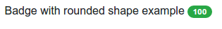
Bootstrap 4 also provides .badge-pill class which makes badges more rounded.
<p>Badge with rounded shape example <span class="badge badge-success badge-pill">100</span></p>
The output of above sample is:
Screenshot 6


