Some CSS best practices are given below:
-
Partitioning the CSS file
It’d be an excellent idea if you could divide your CSS report into diverse portions rather than integrating the whole thing right into a single CSS report. You can make it less difficult to manage your CSS report by partitioning it into numerous parts such as the footer.Css, header.Css, and others.
-
Overriding
As in the case of enforcing dev tools, builders are also afraid when it comes to overriding. Most of the CSS frameworks such as the bootstrap and basis are innovative, however, you may customize it as consistent with your desires. Whenever an update is made to the framework your changes could be routinely overridden. You could also create a bootstrap-overrides.Css record that enables you to customize the CSS file as you want.
-
Set margins or padding then reset them
I often see people set margins or padding for all elements then reset them to the primary or last element. I don’t know why they use two rules when you can be together. It is very easy to set the edges and padding for all the required elements at the same time.
For simpler and more concise CSS, use one among the following: nth-child / nth-of-type selector, the: not () pseudo-class, or adjacent sibling combinator referred to as +.
Bad Approach:

.items

{

margin-right:1.6rem;

}

.items:last-child{

Margin-right:0;

}

Best Approach:

.items:not(:last-child){

margin-right:1.6rem;

}
-
Add display: block position for an element with absolute or static
Did you know that you do not need to include the display: block for elements with position: absolute or position: fixed as it is by default?
Also, if you use inline- * values, they will change as follows: inline or inline-block will change to block, inline-flex -> flex, inline-grid -> grid, and inline-table -> table.
So, just type position: absolute or position: fixed and display only if you would like flex or grid values.
Bad Approach:

.button::before{

content:””;

position:absolute;

display:block;

}

Best Approach:

.button::before{

content:””;

position:absolute;

}
-
Use transform: translate (-50%, -50%) To Center
There was a popular problem that caused a lot of trouble. In particular, one solution is to use a combination of perfect position and changeable assets. Due to this technology, chromium-based browsers have issues with blurred textures.
But with the advent of Flexbox, this technique is, in my opinion, no longer relevant. The thing is, it doesn’t solve the problem of the blurred text. What’s more, it allows you to use five features. So, I want to share a trick that reduces the code to two attributes.
We can use the margin: the auto and bra browser will focus the element inside a flex container. Just two features and that’s it.
Bad Approach:

.parent {

position: relative;

}

.child {

position: absolute;

top: 50%;

left: 50%;

transform: translate(-50%, -50%);

}

Best Approach:

.parent {

display: flex;

}

.child {

margin: auto;

} -
Set display: block for Flex Items
When using Flexbox, it is important to remember that when you create Flex containers (include display: flex), all children (flex items) are blocked.
This means that the elements are set to display and can only contain block values. If you will set inline or inline-block, then you will need to change to block, inline-flex -> flex, inline-grid -> grid, and inline-table -> table.
Therefore, do not include displays: block flex items. The browser will do just that for you.Bad Approach:
.parent {
display: flex;
}
.child {
display: block;
}
Best Approach:
.parent {
display: flex;
} -
Compress
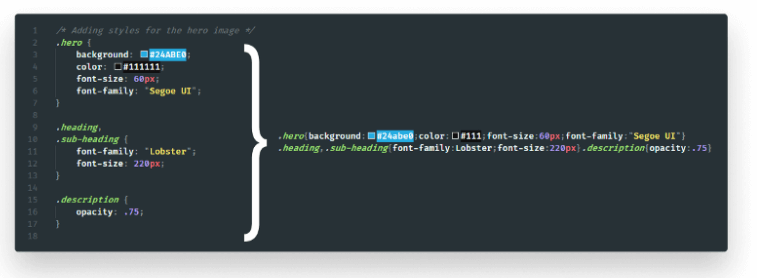
Lastly, compress your bundles to cut back their size. Compression removes comments and whitespaces therefore your bundles need less information to fetch.

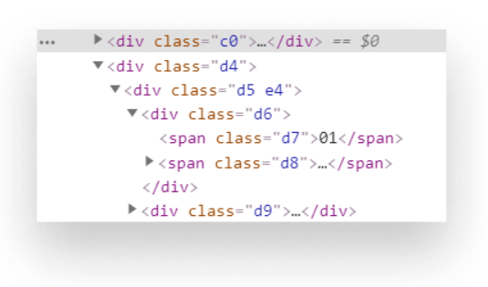
If you haven’t already, change compression on the server-side also.Another good way to more scale back the dimensions of your CSS — and markup— is obfuscating category names.

People having good knowledge of Financial accounting can get an Accounting Certification Exam from StudySection to increase their chances of getting a job in this field. You can get a foundation level certification if you are new to Financial accounting or you can go for advanced level certification if you have expert level skills in Financial accounting.


