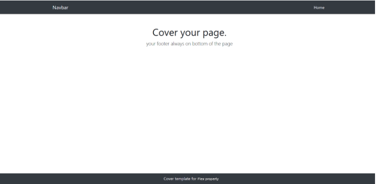
In this post, we will explain how we can fix the footer position on the page with the help of css3 flex property. The flex property sets the flexible length on flexible items. After using the below CSS code the footer will always remain at the bottom. If the content on the page is less, the footer will still remain at the bottom and we do not need to use any CSS fixed property for that. All this gets solved with this property.
CSS Code:
<!DOCTYPE html>

<html>

   <head>

      <meta http-equiv="content-type" content="text/html; charset=UTF-8">

      <meta charset="utf-8">

      <title>BS4

      <meta name="description" content="using CSS Flexbox and working">

      <meta name="keywords" content="sticky footer flexbox">

      <meta name="viewport" content="width=device-width, initial-scale=1">

      <link rel="stylesheet" href="https://maxcdn.bootstrapcdn.com/bootstrap/4.0.0/css/bootstrap.min.css">
<style>
* { margin:0; padding:0; }
*, *:before, *:after { box-sizing:border-box; }
.flex-site {
display:-ms-flexbox;
-ms-flex-direction:column;
}
#page {
width:100%;
min-height:100vh;
display:-webkit-flex;
display:flex;
-webkit-flex-direction:column;
flex-direction:column;
}
#content {
-webkit-flex-grow:1;
flex-grow:1;
}
</style>
</head>
<body class="flex-site">
<div id="page">
<header>
<nav class="navbar navbar-expand-lg navbar-dark bg-dark">
<div class="container">
<a class="navbar-brand" href="#">Navbar</a>
<button class="navbar-toggler" type="button" data-toggle="collapse" data-target="#navbarNavDropdown" aria-controls="navbarNavDropdown" aria-expanded="false" aria-label="Toggle navigation">
<span class="navbar-toggler-icon"></span>
</button>
<div class="collapse navbar-collapse " id="navbarNavDropdown">
<ul class="navbar-nav ml-auto">
<li class="nav-item active">
<a class="nav-link" href="#">Home <span class="sr-only">(current)</span></a>
</li>
</ul>
</div>
</div>
</nav>
</header>
<div id="content">
<div class="container">
<div class="row justify-content-center">
<div class="col-7">
<main role="main" class="inner cover text-center mt-4 pt-4">
<h1 class="cover-heading">Cover your page.</h1>
<p class="lead"> your footer always on bottom of the page</p>
</main>
</div>
</div>
</div>
</div>
<footer class="mastfoot mt-auto text-center pt-2 text-white bg-dark">
<div class="inner">
<p>Cover template for Flex property.</p>
</div>
</footer>
</div>
<!-- Optional JavaScript -->
<!-- jQuery first, then Popper.js, then Bootstrap JS -->
<script src="https://code.jquery.com/jquery-3.2.1.slim.min.js"></script>
<script src="https://cdnjs.cloudflare.com/ajax/libs/popper.js/1.12.9/umd/popper.min.js"></script>
<script src="https://maxcdn.bootstrapcdn.com/bootstrap/4.0.0/js/bootstrap.min.js"></script>
</body>
</html>
OutPut:
jQuery presents a tree-like structure of all the elements on a webpage simplifying the syntax and further manipulating such elements. The jQuery Certification Exam by StudySection will secure your fundamental knowledge and a basic understanding of jQuery as an asset to improve your skills.


