What is CSS Grid?
CSS Grid Layout excels at dividing a page into major regions or defining the relationship in terms of size, position, and layer, between parts of a control built from HTML primitives.
Like tables, grid layout enables an author to align elements into columns and rows. However, many more layouts are possible or easier with CSS grid than with tables. For example, a grid container’s child elements could position themselves so they actually overlap and layer, similar to CSS positioned elements.
How to Create a Perfect CSS Grid on Your Website
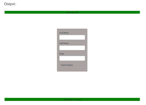
The example below shows a track grid with new rows created for the header and footer. Items have been placed onto the grid using line-based placement.
HTML:
<!DOCTYPE html>

<html lang="en">

<head>

<meta charset="utf-8">

<meta name="viewport" content="width=device-width, initial-scale=1, shrink-to-fit=no">

<title>CSS Grid Example</title>

<link rel="stylesheet" href="https://stackpath.bootstrapcdn.com/bootstrap/4.3.1/css/bootstrap.min.css">

<link rel="stylesheet" href="https://maxcdn.bootstrapcdn.com/font-awesome/4.7.0/css/font-awesome.min.css">

</head>

<body>

<div class="form-screen">

<div id="grid">

<div class="col align-self-start">

<div class="container">

<header>add logo here
</div>
</div>
<div class=”col align-content-stretch”>
<div class=”container”>
<section>
<div class=”form”>
<div class=”form-group”>
<label>First Name
<input type=”text” class=”form-control”>
</div>
<div class=”form-group”>
<label>Last Name
<input type=”text” class=”form-control”>
</div>
<div class=”form-group”>
<label>Email
<input type=”text” class=”form-control”>
</div>
<div class=”form-group”>
<input type=”submit” class=”btn primary-btn”>
</div>
</div>
</section>
</div>
</div>
<div class=”col align-self-end”>
<div class=”container”>
<footer>add footer link here</footer>
</div>
</div>
</div>
</div>
<script src=”https://ajax.googleapis.com/ajax/libs/jquery/3.3.1/jquery.min.js”></script>
<script src=”https://cdnjs.cloudflare.com/ajax/libs/popper.js/1.14.7/umd/popper.min.js”></script>
<script src=”https://stackpath.bootstrapcdn.com/bootstrap/4.3.1/js/bootstrap.min.js”></script>
</body>
</html>
CSS
html, body, #grid, .form-screen

{

height:100%;

}

/* Some custom styles to beautify this example */

.row{

margin-top:0rem;

height: 100%;

}

#grid {

display: grid;

grid-template-areas: "1";

grid-gap: 0px;

grid-auto-columns:100%;

}

#grid > div {

text-align: center;

}

header, footer

{

background: green;

}

section {

width: 250px;

margin: 0 auto;

background: #a8a2a2;

border-radius: 4px;

padding: 20px;

text-align: left;

margin-top: 30px;

margin-bottom: 30px;

}
Benefits of a CSS Grid
Thanks to its flexibility, it allows web designers to achieve almost any type of layout that they need. It’s great for dividing up the significant regions of a page into smaller sections or setting the relationship between elements in terms of size and position.
While it aligns page elements by columns and rows like tables, the grid isn’t limited by a particular content structure. This makes it possible to create a wider variety of website layouts than would be practical with tables alone.
If you have skills in PHP programming and you want to enhance your career in this field, a PHP certification from StudySection can help you reach your desired goals. Both beginner level and expert level PHP Certification Exams are offered by StudySection along with other programming certification exams.


