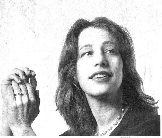
Susan Kare, the sister of aerospace engineer Jordin Kare, is an artist and a graphic designer. She was born on February 5, 1954, in Ithaca, New York. Plenty of the interface elements and typefaces for Apple Macintosh in the 1980s were a contribution from Kare’s design works. She served as Creative Director at NeXT, the company formed by Steve Jobs after he left Apple in 1985. Being with NeXT, she worked on client projects for IBM and Microsoft. She also worked for Facebook and Pinterest recently. In April 2018, Kare received the American Institute of Graphic Arts medal as recognition of her design work.
In her high school, Kare worked at a museum for an amazing designer, Harry Loucks who introduced her to typography and graphic design. In 1971, she graduated from Harriton High School and then graduated summa cum laude with a BA in Art from Mount Holyoke College in 1975. She started a job at Fine Arts Museum at San Francisco after graduating from New York University with a Ph.D. in Fine Arts. Soon she felt like the job was not appropriate for her and she wanted to work in her own studio. Shortly after that, she earned a commission to sculpt a razorback hog out of steel from Arkansas museum. In the early 1980s, while working in her garage in Palo Alto, she received a call from a high school friend Andy Hertzfeld, who worked as a lead software architect for the emerging Macintosh operating system.
She joined the Macintosh software group and her first task was to develop fonts for the new computer. Kare designed the first consistently spaced digital font family for the Mac, that made the text look more like the ones written in the books making the overall view of the operating system look natural. Kare took inspiration from the collective intelligence of her fellow mates and continued to design visual elements for Apple’s extensive GUI (Graphic User Interface). She started by sketching pointing hands, arrows, and paintbrushes in a notebook as no application for designing icons was available at that time. A pencil and a graph paper were used to draw the prototype of the latest, user-friendly face of computing in which, each square represents a pixel.
The visual vocabulary that Kare gave to Mac OS was universally appealing and intuitive. She did not think of each image as a tiny illustration but her aim was to design instantly understandable signs to decrease the complexity in using a computer. Kare’s ideas came from a lot of sources like the geeky gadgets and toys that festooned her fellow designers’ cubicles, the history of Asian art, and the glyphs that Depression-era hobos chalked on walls to point the way to a sympathetic household. The Chicago typeface, the Geneva typeface, the original monospace Monaco typeface, “Clarus the Dogcow”, the “Happy Mac” icon, and the Command key symbol on Apple keyboards are Kare’s most recognizable works from her time with Apple. Kare’s icons helped a lot of creative innovators in the early 80s who found technology very complex and stressful.
Kare started working with NeXT as a designer after leaving Apple. Here she worked with clients such as IBM and Microsoft. She worked on projects for Microsoft which included the card deck for Windows 3.0’s solitaire game and various icons and design elements for Windows 3.0. A lot of her icons like those for notepad and control panel remained unchanged on the operating systems by Microsoft until Windows XP. She designed icons and elements for OS/2 for IBM. Iconography in the Nautilus file manager was her contribution to Eazel.
She turned into a member of the advisory board of Glam Media (now Mode Media) in 2003. She developed icons for “Gift” feature of Facebook between 2006 and 2010. A few versions of Mac OS X features one of the Gift icons named “Big Kiss” for a user account picture. She developed the website, icons, identity and their Internet-enabled alarm clock for Chumby Industries, Inc in 2007. Pinterest hired Kare in 2015 as a product design lead. At present, she is the head of a digital design practice located in San Francisco and sells fine-art prints.
Susan Kare believed that icons should be similar to road signs and not just simple illustrations. They should be easily understood and should not contain extra details which can confuse the user. Also, she thought that once a well-designed and meaningful icon is crafted it should stay for a long duration and should not be resigned frequently.


Good post